Diagramme à barres
Un diagramme à barre est un graphique qui présente des catégories avec des barres rectangulaires. La taille du rectangle est proportionnelle à la valeur. Les barres peuvent être tracées horizontalement ou verticalement.
Les commandes pour des barres horizontales/verticales sont similiares:
bar(x, height, width=0.8)barh(y, width, height=0.8)
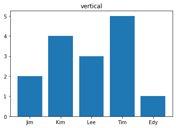
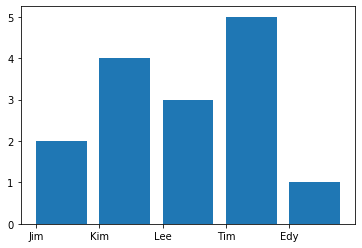
Barres verticales
Voici un graph vertical avec la fonction bar.
labels = ['Jim', 'Kim', 'Lee', 'Tim', 'Edy']
a = [2, 4, 3, 5, 1]
plt.bar(labels, a);
plt.title('vertical')
Text(0.5, 1.0, 'vertical')
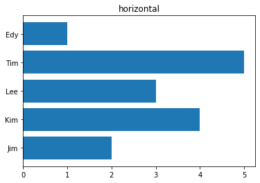
Barres horizontales
Voici un graphe horizontal avec la fonction barh.
plt.barh(labels, a)
plt.title('horizontal');
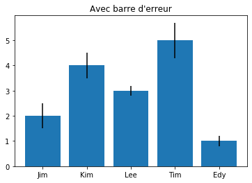
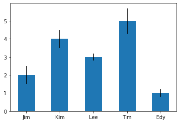
Barres d’erreur
errors = [0.5, 0.5, 0.2, 0.7, 0.2]
plt.bar(labels, a, yerr=errors)
plt.title("Avec barre d'erreur");
Text(0.5, 1.0, "Avec barre d'erreur")
Épaisseur des barres
plt.bar(labels, a, 0.5, yerr=errors);
width = [0.1, 0.2, 0.4, 0.8, 0.2]
plt.bar(labels, a, width, yerr=errors);

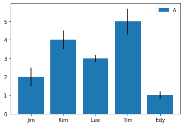
Étiquette
plt.bar(labels, a, yerr=errors, label='A');
plt.legend();
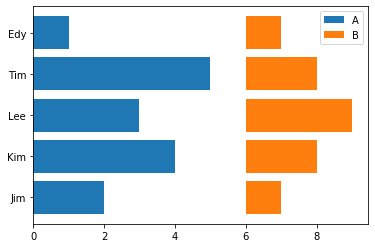
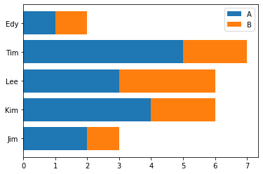
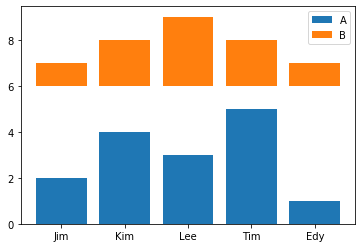
Graphes juxtaposés
plt.barh(labels, a, label='A');
plt.barh(labels, b, left = 6, label='B');
plt.legend();
plt.barh(labels, a, label='A');
plt.barh(labels, b, left = a, label='B');
plt.legend();
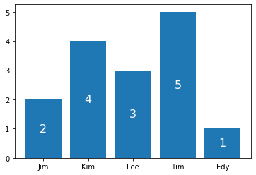
Ajouter un texte
En haut de chaque colonne ou au centre nous pouons placer la valeur numérique.
plt.bar(labels, a)
for x, y in enumerate(a):
    plt.text(x, y, y)

plt.bar(labels, a)
for x, y in enumerate(a):
    plt.text(x, y/2, y, fontsize=16, color='white', ha='center', va='center')
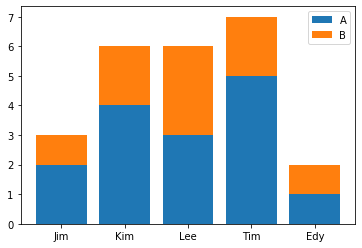
Barres empilées
b = [1, 2, 3, 2, 1]
plt.bar(labels, a, label='A');
plt.bar(labels, b, bottom = 6, label='B');
plt.legend();
plt.bar(labels, a, label='A');
plt.bar(labels, b, bottom = a, label='B');
plt.legend();
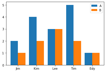
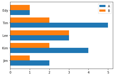
Barres groupées
Nous pouvons déplacer les deux courbes pour créer un graphique avec multiple
x = np.arange(5)
w = 0.4
plt.bar(x-w/2, a, w, label='A')
plt.bar(x+w/2, b, w, label='B')
plt.legend()
plt.xticks(x)
plt.gca().set_xticklabels(labels);
plt.barh(x-w/2, a, w, label='A')
plt.barh(x+w/2, b, w, label='B')
plt.legend()
plt.yticks(x)
plt.gca().set_yticklabels(labels);
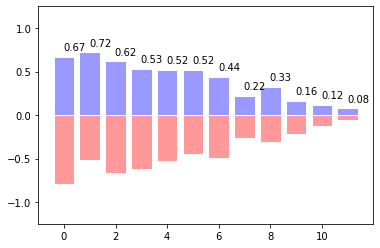
Barres en 2 directions
n = 12
X = np.arange(n)
Y1 = (1-X/float(n)) * np.random.uniform(0.5,1.0,n)
Y2 = (1-X/float(n)) * np.random.uniform(0.5,1.0,n)

plt.bar(X, +Y1, facecolor='#9999ff', edgecolor='white')
plt.bar(X, -Y2, facecolor='#ff9999', edgecolor='white')

for x,y in zip(X,Y1):
    plt.text(x+0.4, y+0.05, '%.2f' % y, ha='center', va= 'bottom')

plt.ylim(-1.25,+1.25)
plt.show()